
2016 was wild - in just about every conceivable way. To usher in the 2017 season, trend forecasters, designers and makers have been hard at work to establish fresh new compositions, studying the effects of different layouts, architecture, and aesthetics.
The biggest emerging human trends of this New Year include feelings of unity, strength, and the power of togetherness. Society is undergoing rapid changes and to keep our heads above water, a constant reminder that life can be beautiful is needed more and more every day.
So what’s the biggest contemporary design formula of 2017 thus far? It’s a simple philosophical gist really; be yourself, and do what makes you happy. You needn’t be a trendy downtown innovator to create a perfect sense of style for your home, apartment, or cottage - you just need to know what is going to make you feel alive, and go after it.
To help you kick start your redesigning efforts of 2017, we’ve compiled some of our favourite overall design and colour theory trends that are emerging as powerful forces to be reckoned with.
Art, Art, Art
New for 2017 includes a massive dedication to all things artistic, seemingly integrating the interpersonal subtleties of self-expression and complimentary colour palettes and textures. Art of any kind bursts with individuality and
You don’t have to frequent galleries or be a fine art aficionado to curate great art within your own home - it’s all about developing and nurturing energies that contribute to the overall aesthetic of your spaces. In the office, you may wish to build an intense, capable vitality that contributes to efficiency and productivity. While in the living room or kitchen, you can easily transform a space by adding a wispy, relaxing visual that boosts feelings of relaxation and calm composure.
Consider displaying your favourite vintage movie or concert poster with an oversized postmodern frame that elevates a personal favourite to a compelling focal piece that ushers in conversation. Similarly, frame the artwork your kids bring home in the same way. Enlarge prints of finger paintings and colourful mishmash that add big personality and a sense of family as a classic mantle portrait or living room attracter.
If fine art is more your style, consider investing in a print that depicts work from the era of expressionism. Canvas prints are more attainable than ever before and do well in straight cut rooms to offer some dynamic play and lively juxtaposition. As a recommendation, 2017 marks the 100th anniversary of the death of iconic Canadian painter, Tom Thomson - the world famous Ontario expressionist who sparked the Group of Seven. His painting, Sunset, Canoe Lake, offers rich colour, palatable texture, and a sense of confident composure that exudes classic Canadiana.
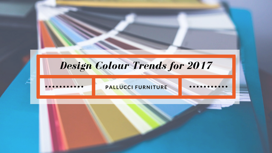
Colours
Prepare to be inundated by bright, cheery colours in 2017, paired with patterns and upbeat character.
Bright Green has been named the 2017 Pantone Colour of the Year. Positive shades of green are meant to establish refreshment, and revitalization. In colour theory, green is associated with the cool colours, cited as a purveyor of trust, cleanliness and calm. This hue is perfect for boosting the mood of mudrooms, sunrooms, breakfast nooks and even home offices or children’s bedrooms. A postmodern extension of bringing greenery into the room is to mix a cream white with a green, adding a hint of minty freshness to a classic blank aesthetic that allows your decor to do the talking.
Navy is quickly becoming the new black. Navy blues are slated to become a popular accent colour for a bedroom, or as a refresh to the kitchen cupboards. Unlike black, it offers a modern twist on to a traditional feel and can help to reduce the feeling of a shrinking room, as black often does. Navy pairs well with just about any existing colour palette, complimenting oranges, greens, whites, and reds.
Where black continues to be popular, is now in the kitchen. Black cupboards, poured black concrete or ceramic countertops and the combination of black/stainless appliances coupled with live greenery in the heart of the house make black the new white in terms of kitchen hues.
“Raw” white is another emerging colour choice for embracing imperfection with open arms. Many colour trends for 2017 are in some way related to a feeling of open transparency, and this intriguing concept is no exception. Think of ‘raw’ white as a bone white, china white, or chalky white for an organic hue that beckons you to add texture to your spaces - without the outdated feelings of sterility or barrenness.
Layouts
Trends for interior layouts are very much on side with the emergence of honesty and transparency in our society. Look to open concept kitchens and living room combinations for increased facetime with your family and guests, as well as functionality - very much present in the reinvention of the kitchen island, the hub of the room, including storage and purpose from all sides. Long gone are the kitchen islands of old that doubled as bar tops, and pseudo lounges. 2017 is all about blending the lines between form and function.
Interior layout design is prompting the dominance of a minimalist composition, heading in the direction of smaller and smaller appliances, cradled in smaller spaces. This isn’t meant to increase inefficiency, but rather made to help people consider the scope of their established behaviours. The big bathtubs of traditional bathrooms for example aren’t accompanying the new interior architecture of modern spaces, rather a stand up rain showerhead accented by textured mosaic tile is the new norm. These space-saving features make rooms feel larger, and are often more efficient on building materials, maintenance, and labour costs.
Decor
Interior decor is changing as well. 2017 will see attention paid to detailed nuances and pieces that add life and spirit to our interior spaces.
This can include construction and architectural additions like faux ceiling beams, and original hardwood floors that are left unfinished to show off their wear and tear, to textured sofas and pleated chairs - adding a hint of quality and smoothness to our living spaces. Allowing decor to speak on behalf of your larger spaces allows your personality as a curator of your home to come through in spades.
The ol’ coffee table benefits from replacing the large central platform with smaller benches, live-edge timber, or industrial materials that regain space within the room and encourage less clutter building throughout the week. Replacing large coffee tables encourages the addition of side/end tables to complete the aesthetic of living rooms and lounges, and eliminates the possibility of eating dinner in front of the TV again, encouraging use of your kitchen nook, dining room, or bistro table on the veranda - again, all for the sake of putting in in touch with our families and promoting togetherness.
Living plants are always going to be a good idea when it comes to adding a breath of life to interior decor, adding freshness and greenery. They pair well with end tables, buffets, hutches and coffee tables - and they don’t have to be old school money trees. Experiment with cacti, succulents, carnivorous plants like Venus flytraps, or broadleaf ferns.